Case study: deploying AI to summarise northern-European daily climate for our client.
Our client is interested in the effects of UK weather & climate patterns on their resources. ESD were commissioned to investigate this and devised a set of summary climate-patterns describing daily northern-European weather.
These can be used to isolate current climate-risks and plan for future conditions. Here’s how we deployed self-organising artificial intelligence to deliver this project & help our client.
Summary Patterns for Climate
The driving conditions for weather in any location are generally described by atmospheric pressure patterns over the wider region. Think of the ‘Beast From East’ in early spring 2018: the pattern of atmospheric pressure over northern Europe leant itself to easterly airflows – bringing exceptionally cold air from central Eurasia. Knowing the general large-scale airflow enables you to predict the likely weather over particular city, or domain.
London 2018, 'Beast from the East': you can make a pretty accurate guess as to the local weather knowing just the general pressure patterns over Northern Europe.
These relationships vary throughout the year and hold immense value, since you can then search for analogue pressure conditions in forecasts, and estimate local weather, without relying on the numerical weather prediction model getting the local forecast of secondary weather variables (e.g. rainfall) exactly right.
Self-organising AI
But first, you need to distil the observed pressure patterns into a set of representative conditions: the distribution of atmospheric pressure over northern Europe varies day-to-day yet many days are, in fact, fairly similar with reasonably minor differences.
We selected a k-means clustering technique to condense daily weather series into a smaller representative sample. This is a self-organising AI algorithm which categorises observations to reduce grouping variance.
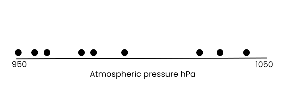
How does it work? Imagine one grid point on Earth with a series of, say, 9 days of atmospheric pressure readings. These can be represented simply as shown below – each dot is a day:
I’ve exaggerated the data here but you can see three obvious groupings: low pressure, medium pressure and higher pressure.
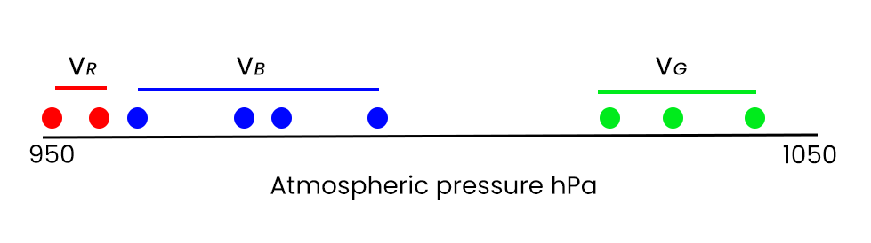
Running the k-means clustering will randomly select observations and try to minimise the observational distance (the variance, v) between each selected observation and all of the remaining observation pool.
Here, I’ve imagined configuring the algorithm to find 3 solutions, or clusters: red, blue and green. The first attempt of the algorithm might look like this – not a great solution, since we can see, by eyeballing, that the left most blue dot would be better allocated as red:
The k-means algorithm will continually randomly sample different permutations of groupings until establishing a selection that minimises the value of v, for each colour VR, VB and VG.
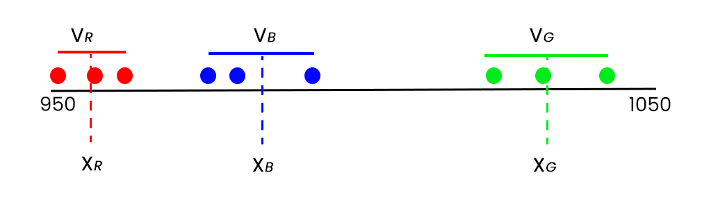
The optimal solution the algorithm will arrive at in this case is, you guessed it, this:
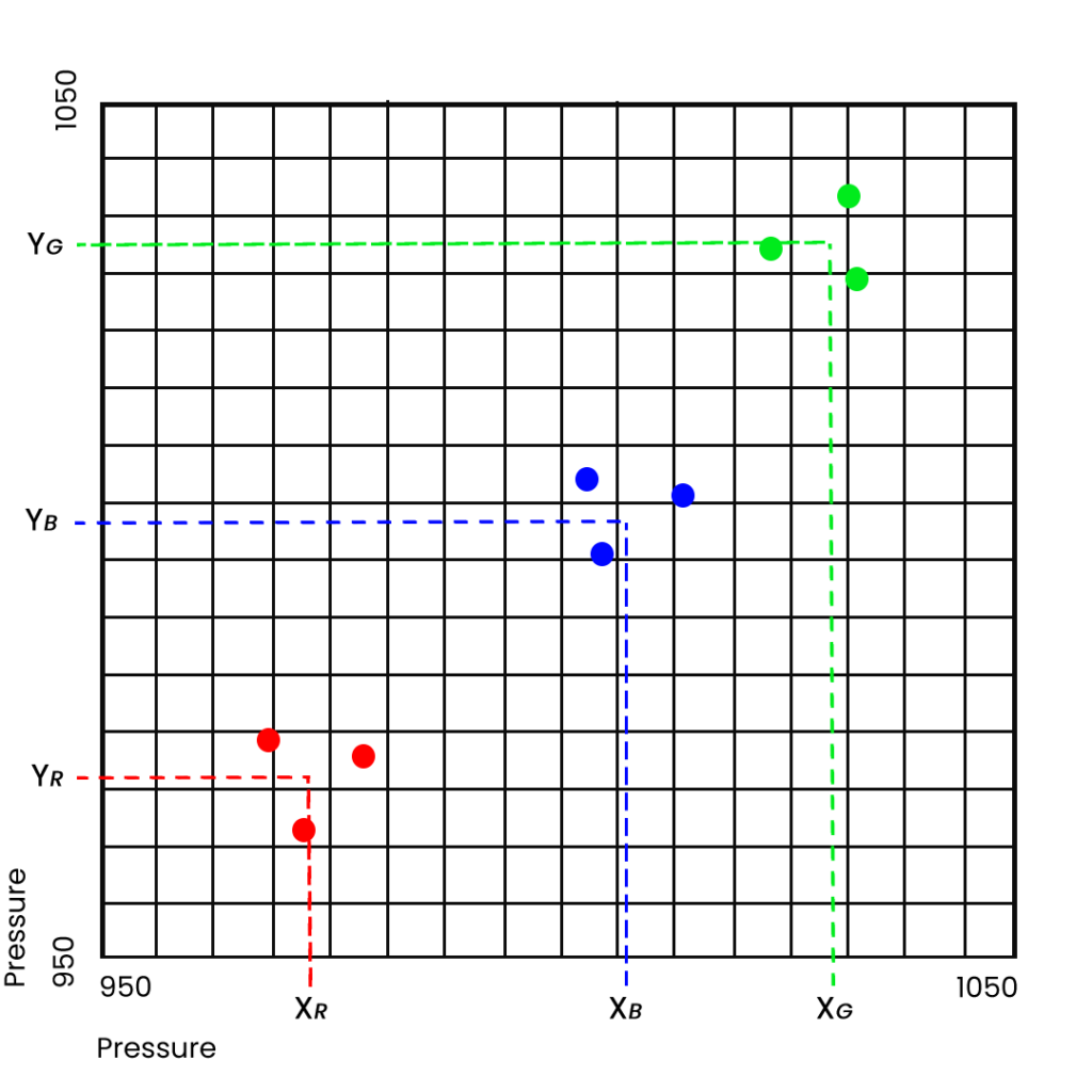
The solution, then, has 3 values – the corresponding values
on the x-axis of the mean of each of the three groupings, XR (red) XB (blue) XG
(green).
Space points as new dimensions
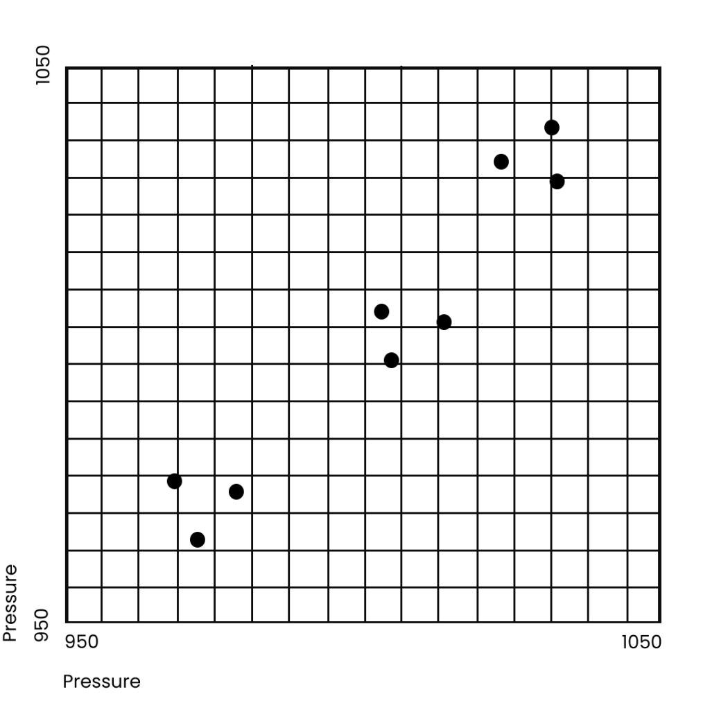
What if we have two grid points – or locations, or cities – each with 9 days of observations. Our starting data would look something like this:
The AI search principle remains exactly the same as if we had one grid point, but we are aiming to reduce the value of v now in two directions – dimensions – x and y.
Once the AI has found the optimal solution – three tendencies for either low, medium, or high pressure, each solution will have two values — one on the x dimension (XR, XB, XG) and one on the y dimension (YR, YB, YG):
In so far as the methodology is concerned each space point with observations introduces a new dimension to data space.
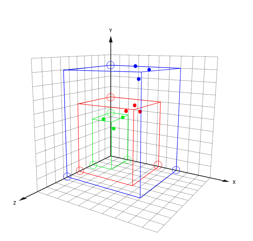
Pictured below is a new data set, again of 9 days, but now with observations at 3 grid points, or cities. Each location point is a dimension and the observations (filled circles) must accordingly now be plotted in 3-D space, with the x, y and z dimensions representing one of the grid point (or city) locations.
The AI solution again arrives at three clusters – red, green, blue – and, this time, each cluster solution has three values – one for each dimension and shown as the hollow circles sitting on the axis arms:
For each physical location added to the calculation, a new dimension is added. The data are clouds in this space and the clustering calculation will allocate categories to clouds of data that share the same space.
Beyond 3 locations (dimensions), we can’t draw – Google ‘hypercube’, though for a representation if you like.
Nonetheless we can configure and run the k-means clustering calculation through any number of dimensions – and the algorithm will work perfectly.
In the case for our client, we selected 88 grid points to cover the northern-European domain, as illustrated below.
The k-means algorithm constructs the observations into a cloud field, therefore, of 88 dimensions – not something you’d ever want to try and draw. The data are daily fields, spanning the years 1850-2003, which amounts to a matrix of 56247 points in 88-dimensions. Once the solution is reached, loadings are returned for the pre-selected number of summary patterns – three in the examples above – but 30 in practice for our client’s calculation.
Fore-armed is fore-warned
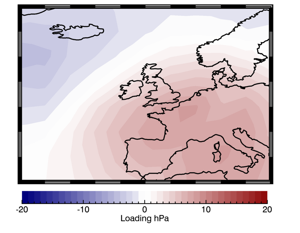
The full 30 set of solutions remains privy to our client, but here’s an example of one of them. The plot depicts the atmospheric pressure anomalies, the loadings, associated with the fifth summary pattern:
In this example, high pressure dominates central Europe with low pressure to the north west of the domain, shown by the relative red and blue shading. This pressure configuration often occurs in summer. To make it into the top 30 detected clusters there must be a reasonable percentage of days with pressure distributions analogous to this and, in fact, something fairly similar occurred in July 2022, resulting in a 48-hour southerly airflow which lead to the record-breaking heatwaves in the UK and France.
Knowing the relationship between each cluster type and the local weather, or even better the material impacts on your organisation (e.g. resources, logistics, continuity risk etc), is the icing on the cake – and these relationships are usually pre-diagnosed in pre-cursor projects, something that we also deliver for clients.
Once fore-armed with these correlations we can then search forecast simulations for analogue pressure distribution occurrences and help our clients to form exceptionally-effective mitigation plans. These will be effective even when the finer details of the forecasts, e.g. point-scale rainfall, is not accurate, negating a substantial limitation of using direct NWP fields for your climate risk strategy.
Applying innovative techniques such as these, holistically, to climate, weather and organisational data returns exceptional intelligence that can both elicit unknown climate-related risks and will act as the corner stone for the development of robust hedging strategies, as is the case for our client’s next phase.
You can contact us directly to learn more about more about our services, innovations, and work which is enabling organisations mitigate their climate and weather risk.